


|
Gradation.
Gradation is an oil painting technique where there is gradual change from one colour to another, or where a single colour gradually lightens or darkens because of a change in lighting. Follow this Oil Painting free tutorial to learn about two ways to achieve this effect.This is one of the most effective oil painting techniques. Oil painting is king where Gradation is concerned. No other medium comes close, in my opinion. Oils dry slowly so the painter has more time make subtle changes. Remember We are copying nature. Nature imbues flesh, stone, wood, fluids and even the atmosphere with gradations of colour. As painters we strive to copy this in order to create the illusion of three dimensions on a two dimensional surface.
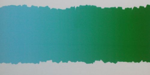
Materials used 1st exercise: Cobalt blue with a little ivory black to tone it down. Viridian. 1 inch flat brush. four fan brushes size 4 - You can use one if you wish but as the brush needs to be dry and clean it was simply more practical for me to use more than one. Artist's grade turpentine. Reeves canvas board ready primed. Materials used 2nd exercise: Cadmium yellow, cobalt blue and cadmium deep red. Half inch flat brush and a Winsor and Newton series 340 size 5 mop brush. The mop brush came about when I was looking to make a gradation between two large areas of colour as seamless as possible. I went to my usual supply shop looking for the softest brush I could find. This turned out to be the mop brush. I was a little dubious that it would work but after some horrendous mistakes I got the hang of it. So far I've cleaned this brush approximately fifty times and it has always sprung back into shape. Reeves canvas board ready primed. Refined linseed oil - Any linseed oil will do but I find this the easiest to work with in Gradation. Exercise 1 1, This is painted far larger than normal. I painted this area of cobalt blue mixed with a tiny amount of ivory black. I used enough turps to get the paint moving and fluid. We don't want thick paint and consequently very obvious brushstrokes.
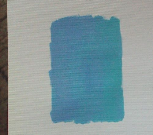
2, Now I added a little viridian to the mix and continued to paint in broad strokes that overlapped one another. I added more viridian and more strokes. I repeated the process until there was more viridian than the original mix of blue and black.
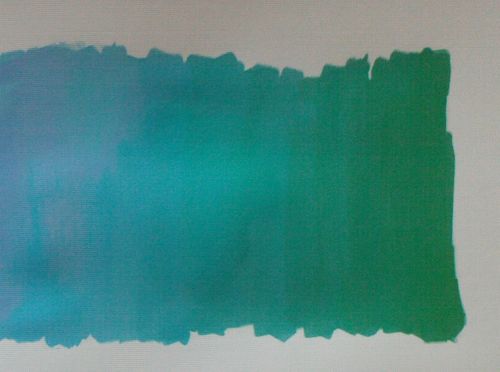
3, I allowed the paint to dry somewhat over a few days (you can start the Gradation process straightaway if you like but you'll get better results if you allow some drying) and then I used a dry fan brush and stroked the paint top to bottom in one direction only. As you overlapped your strokes you should also overlap your dry strokes. The paint is beginning to lose its streaky quality.
4, I changed brushes as I went along to make sure I didn't muddy up the colours. It's important to keep your brush as clean as possible and this is why I used several brushes. As you work along the individual brush strokes will become less obvious.
5, Note the blue on the left is slowly being made to appear flat.
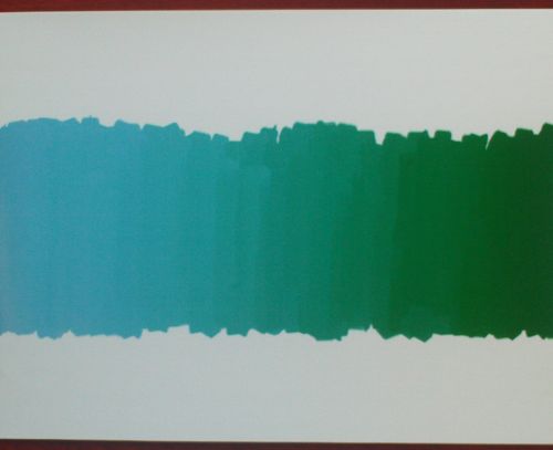
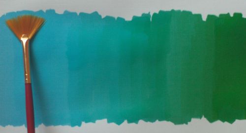
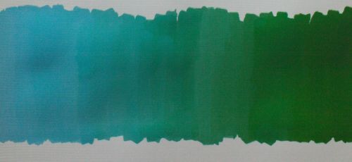
6, Continue along obliterating the original strokes. You can go over this as many times as you wish. Allow to dry and you will end up with a smooth transition of colour. You may not get this right straightaway. It took me a long time to master it. Of course this is mainly a skill you will only need to perfect if you want to work realistically.
Exercise 2 This is a much easier way to produce gradations of colour. 1, I used half refined linseed oil and half cadmium red and made a single vertical stroke. Then I added a little yellow to the paint and made another stroke. I repeated this, adding more yellow and then used pure yellow for the fourth stroke. Try to keep the balance of paint and thinner as you go through the colours but don't get hung up on it. You are aiming for a fluid stroke each time. I added cobalt blue to the yellow to make greens. I added more blue each time until I was ready to place a pure cobalt blue stroke. As you can see you can make as many strokes as you like using any ratio of the two paints. I switched back to the original cadmium red and mixed this with the blue until I worked my way back to pure red.
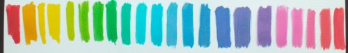
2, Now using a half inch flat brush with a little I work the colours together. I use downwards and upward strokes varying the pressure. Keep cleaning the brush between each colour to get a nice clean transition between colours.
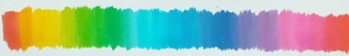
As you can see this has given me a rougher type of gradation. This is handy for more impressionistic works. As in all the techniques in from-sketch-to-oil-painting.com you must practice over and over. Practice with different colours. Take notes and have fun with it. Every mistake is a great lesson in how not to do it and the buzz you'll get from the first time you get it right is very rewarding. This is an exercise in creating gradations between the primary colours. Here I'veused Cobalt Blue, Cadmium deep red, Cadmium yellow. This example of portraiture shows small changes in colour and tone across the subjects face. The effects were made using gradation only. There are only three colours. Burnt umber, a tiny amount of ivory black and cadmium red. This is what can be done with the oil painting technique of Gradation.
Return to Oil Painting Techniques from Gradation. Home
|

