


|
Acrylic Landscape Painting Technique
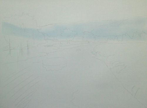
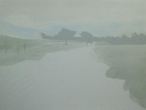
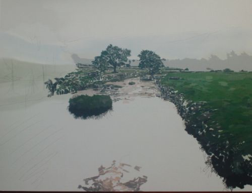
I was looking to practice my Acrylic Landscape Painting Technique. I was drawn to this scene of a clear stream with amazing reflections of the sky. The tree you will see to the left is a representation of what was there. The distant trees and mountains are from sketches I made in the Lake District and Yorkshire. I wanted to frame the stream with a convincing background. I used a canvas board primed with two layers of acrylic gesso. A Hb pencil. A range of colours you will see if you take a look at Painting With Acrylics page. I used Galeria brushes ROUND 1 and 4 with FILBERT 2 and 4 for details. FLAT 2,4,12 and 18 1, I composed this scene carefully with attention to perspective. A stream is easy to get wrong. A badly receded stream is very jarring on the eye and can look amateur if not drawn with respect for perspective. I added two small islands to help with this. The sky will be bland in comparison to the stream and ground. I decided early on that the reflections in the stream were the most important part of the painting.

2, I wash clean water over the canvas and then immediately brush in a thin wash of cerulean blue. My Acrylic Landscape Painting Technique usually requires using the paint in clear washes to begin with.
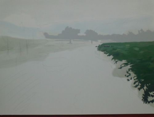
3, I wait around ten minutes and then wash sap green over the middle distance and foreground. I then wait another ten minutes and wash the same green over the foreground and the area of greenery to the right middle distance.
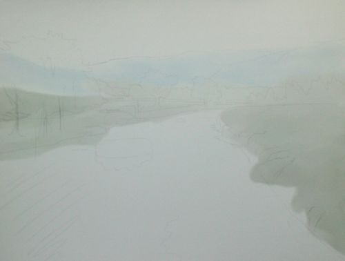
4, Thin paynes grey over a dampened sky. The Paynes grey is thinned with water and two parts flow improver. Flow improver is important for my Acrylic Landscape Painting Technique as it enables a slow worker like me extra seconds and obviously helps the paint to flow better because acrylics dry very quickly.
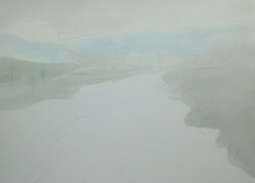
5, I wash in paynes grey across the stream. This is very thinned down with water only and applied over the dry area of canvas. This is a very slight colouring of the canvas board.
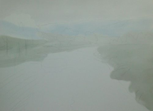
6, I use paynes again for the middle distance trees. The paint was about half thinned with water and worked into the surface with a flat brush until dry. This gives an even, flat effect.
7, Now I use quite thick paint with retarder for the grassy area to the right. Again the retarder is a key element of my Acrylic Landscape Painting Technique, probably more important than the flow improver. The retarder slows drying considerably. I use a flat brush and blocky shapes of Ultramarine Blue, Cobalt Turquoise Light, Ultramarine Violet, Olive Green, Permanent Sap Green, Hooker’s Green. I grey in a log that was actually there. I think it breaks up the green just a little. These small details are very important when I am trying to create a sense of realism.
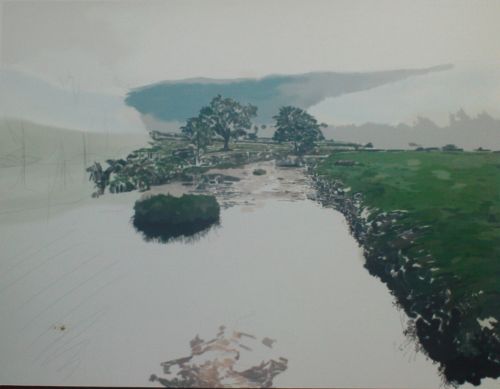
8, Now I add some darks to the grass and rocky scrubby areas on the riverbank.
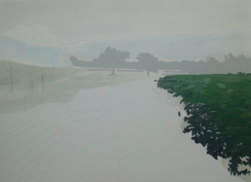
9, I switch momentarily to the sky which has dried thanks to the acrylic paint and darken an area with more paynes grey that was thinned down less than in stage 4. I blend the grey into the sky slightly and then leave to dry. Using darker greens than on the right side I work my way over the mid distance and left bank. I commit to darkening the trees. I use a ROUND 1 to add colour to the small gate and wall we can just see. I use creams for the upper stream mixed from browns, reds and blues with retarder to give me extra mixing and painting time. The colours are not representational. They are guesses, really. Something that contrasts gently with the strong greens.
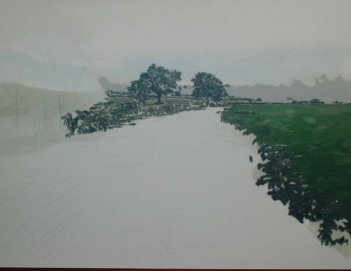
10, I continue to work on the colours of the stream and bank, switching back and forth to make sure they are in harmony. The colours of the small island will give me an idea of how strong the reflection and tree to the left will be. It is my estimate of the middle tone for the entire painting. This is why I have worked from the middle distance to the foreground. In my opinion the decision on mid range colour strength is the most important part of any painting. It gives me a yardstick to measure how strong the darkest and lightest parts of my acrylic painting should be. This is something that comes with practice. It is simple in theory but as painting is a dynamic art where decisions can be made at any stage the theory and practice aren't always easy to reconcile. That's fine though. It's part of the fun for me. Others disagree of course. Some artists plan everything in advance but that doesn't do it for me. I prefer the happy accidents that come with less planning or sometimes no planning at all. The colours on the water are also an attempt to pin down how strong I want to go.
11, I switch to the mountains. The most distant will be shades of misty blue/green and grey made from Cerulean Blue, Payne’s Gray, Ultramarine Blue and Permanent Sap Green. Blues tend to recede which helps to give me the required distance. Acrylics are good for this. I can paint over and over without concern until they look right. I know I can adjust the values of the colour afterwards through glazing or even paint the colours out entirely if necessary without having to wait a long time for drying.
12, I decide to darken the most distant tree line. This wasn't my original plan but I realise the greys are too pale. I use similar colours for the near mountains as the more distant. I know I have more work to do here. There is something I am missing so I don't overwork the paint.
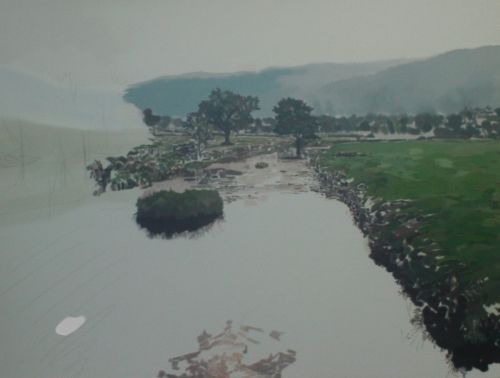
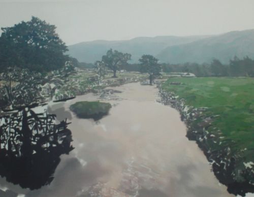
13, I hope the darkest tones may help where my nearside mountains are concerned. I know simply by looking I haven't got the right balance but I'm not 100% sure what to do. The tree and its reflection need to be dark to contrast well with the water and the strong greens otherwise my painting will look weak and washed out on the left. Not the effect I'm after. I build up the colours using Ivory Black, Chromium Oxide Olive Green, Burnt Umber and Permanent Sap Green, mixed on the surface in short heavy strokes with flat brushes. You'll note I use the same colours at different strengths over and over. There is a good technical reason for this which I will be going into more depth with in future tutorials. The basic theory, which certainly works in practice, is that using one, or more rarely, two colours in different strengths, tones and tints either "as is" within the painting or mixed in with other colours, unifies all the colours when our eyes fall upon them. So if your predominant colour is yellow but there are brown and green paints in your scene, you will mix in the yellow with all the brown and green paints used in your painting. I used filbert 4 for the edge details.
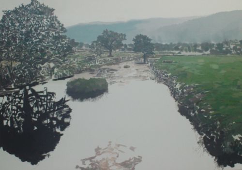
14, Now I use FLAT 18 and FLAT 12 to add large areas of water. The beiges and greys that I used upstream look fine against the other colours so I use them here in larger swathes. I smooth over the upstream area which after doing the foreground water looked too detailed. I decide I don't need the small island to provide distance so paint over it. I spend the drying time allowing my eyes to wander across the scene. I'm looking for anything that doesn't sit right. I do believe we all understand colour harmony and form naturally, whether we have a conventional artistic streak or not. My dad was a gardener with no drawing ability whatsoever. He is that rare creature whose drawings looked like nothing on earth. I was drawing better than he was at the age of three. Yet his gardens were wonderfully designed. He had a knack for understanding how to please the eye in that area. We are all like that in one way or another. I left the painting for a while and came back with fresh eyes and a pot of coffee in me. Everything looked ok. Nothing disturbed me. A little break can do wonders.
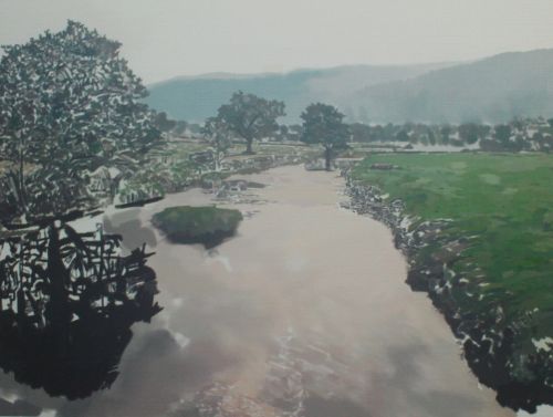
15, I worked my way down and across now, from left to right. The paint was thicker with little dilution and I worked it into the canvas again until there was hardly any moisture left in it. This was important for the style of acrylic painting I was attempting. I used filbert 2, 4, round 1, 4 and was in no hurry here. I used the same paints as the preceding stages. As most were straight from the tube this was easy. I would advise you not to worry unduly about exact colours. The form of anything is more important than the colours. Imagine you are going to paint an elephant. The exact colours would be made from, say various browns and greys but that alone wouldn't make your elephant an elephant. Even if the colours were hyper realistic they wouldn't mean anything without the correct form. The trunk, large body, raggy little tail, tusks and tiny eyes would be the important things. The things that make an elephant an elephant. Get the form right and paint it sky blue it will still be recognizable as an elephant. I did very little with the nearside mountains, my small bewilderment with the strength of colour gone. I made the nearside a little darker and distant mountains a little greyer. Really so simple I'm embarrassed to admit I didn't think of it. Darks come forward and lights go back generally. Please, no emails from colour theorists and know-it-alls who don't paint for a living. These tutorials are practical for people who want to learn and improve not be bored to death with theories. The advantage with finishing a painting in this way is that the section you are working over is the finished article. If it looks right I know by this stage that I've done the job properly.
16, I carry on using the same technique, filling the gaps, working the paint in until almost dry. This is one reason to use decent colours from a good manufacturer like Winsor and Newton. The paint will not produce horrible little dry clumps of paint that poorer brands do. At the very end I use a round brush 1 for the small details on the riverbank and grass. I decided to add the second island again. It does add to the illusion of distance. I also added the same ice cream colour of the water to the sky. Just a little worked into the darker half of the sky to the left really brings the painting together. This mirroring of colour is quite common in landscape painting. I hope you have enjoyed this page on Acrylic Landscape Painting Technique. I will be adding more acrylic tutorials in the near future. 
Return to Painting with Acrylics from Acrylic Landscape Painting Technique Home
|
